
20 Best Author Websites That Boost Book Sales in 2025
June 6, 2025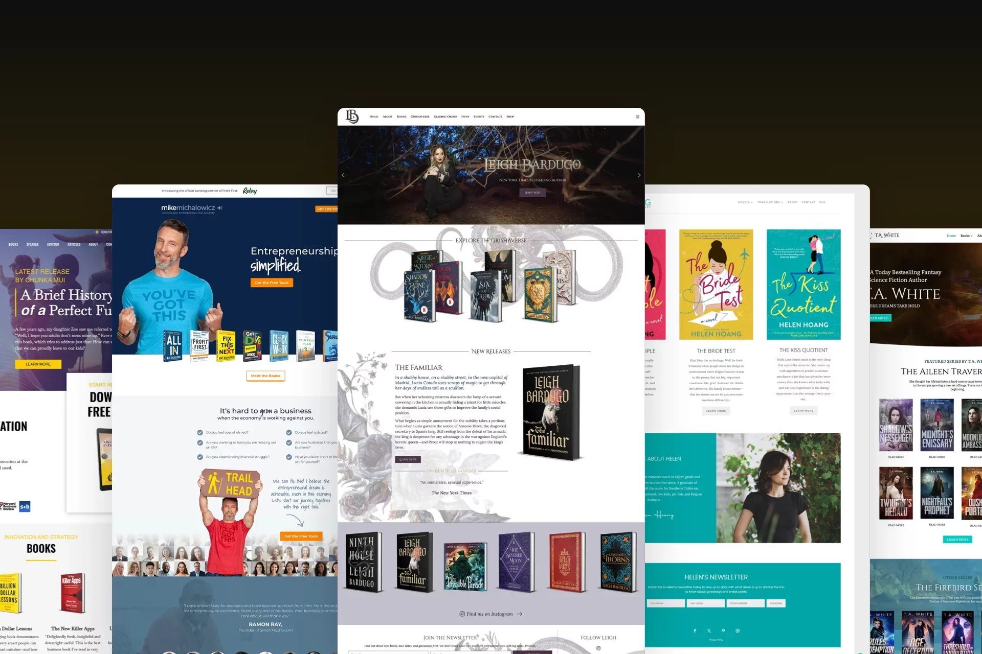
In today’s crowded publishing landscape, a standout website isn’t just nice to have — it’s a powerful sales tool. Whether you're self-published or traditionally published, your author website is often the first impression readers, agents, and media get of you. The best author websites do more than look good — they convert visitors into readers, subscribers, and loyal fans. In this post, we’ve curated 20 exceptional author websites that not only showcase great design but also strategically drive book sales, build email lists, and strengthen personal brands. Use these examples for inspiration to create a site that helps you sell more — and sell smarter.
Why Having a Great Author Website Matters
Your author website is your online home — the one place you fully control. While social media comes and goes, your website is always yours. Here’s why a great author website is essential:
- Builds trust with readers, media, and publishers
- Drives book sales directly or via retailers like Amazon
- Grows your email list, so you can launch books to your own audience
- Showcases your personality and brand as an author
- Creates opportunities for speaking, interviews, and collaborations
Whether you’re launching your first book or growing an author brand, your website is the foundation.
What Every High-Converting Author Website Needs
Not all author websites are created equal. The ones that actually help sell more books and grow a fanbase often include these must-haves:
- Clear value proposition — who you are and what you write, in 5 seconds
- Professional design — clean layout, easy navigation, mobile-friendly
- Prominent call-to-action — “Buy my book,” “Join my newsletter,” etc.
- Email signup form — ideally with a freebie like a sample chapter or bonus content
- Book showcase — beautiful display of book covers with clear buy links
- About page — personal, approachable, and aligned with your genre
- Media kit / press section — if you want interviews or speaking gigs
- Blog or updates — optional, but great for SEO and reader engagement
Top Author Websites in 2025
1. Maggie Stiefvater
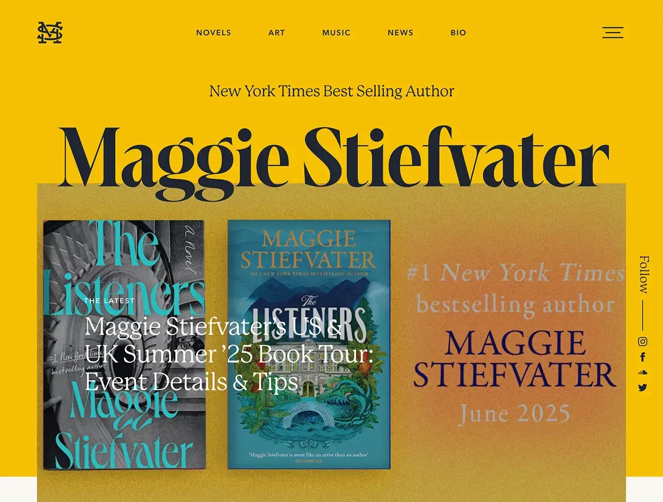
Maggie Stiefvater’s site perfectly reflects her personality and writing style — bold, mysterious, and unapologetically unique. From the handwritten logo to the stark black background and punchy red accents, the design instantly grabs attention and sets the tone for her genre.
What makes this site effective is its strong voice. Every word feels like Maggie is speaking directly to the reader, which builds connection and loyalty. Her homepage features a newsletter signup, book links, and a personal blog — all without overwhelming the visitor.
2. Rupi Kaur
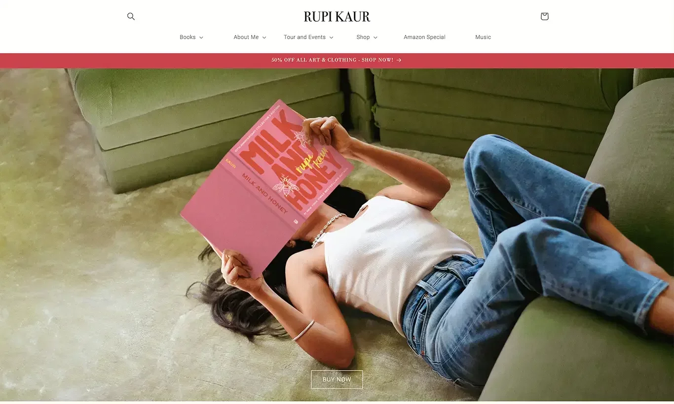
Rupi Kaur’s website is a masterclass in minimalism and brand consistency. Just like her poetry, the design is stripped down and emotionally direct — clean typography, white space, and soft tones make the content feel intimate and elegant.
The homepage immediately introduces her books, events, and latest work without clutter. What stands out most is how seamlessly the site blends creative storytelling with ecommerce. From poetry collections to ticketed performances and even writing courses, it’s all accessible in just a few clicks.
3. Romi Neustadt
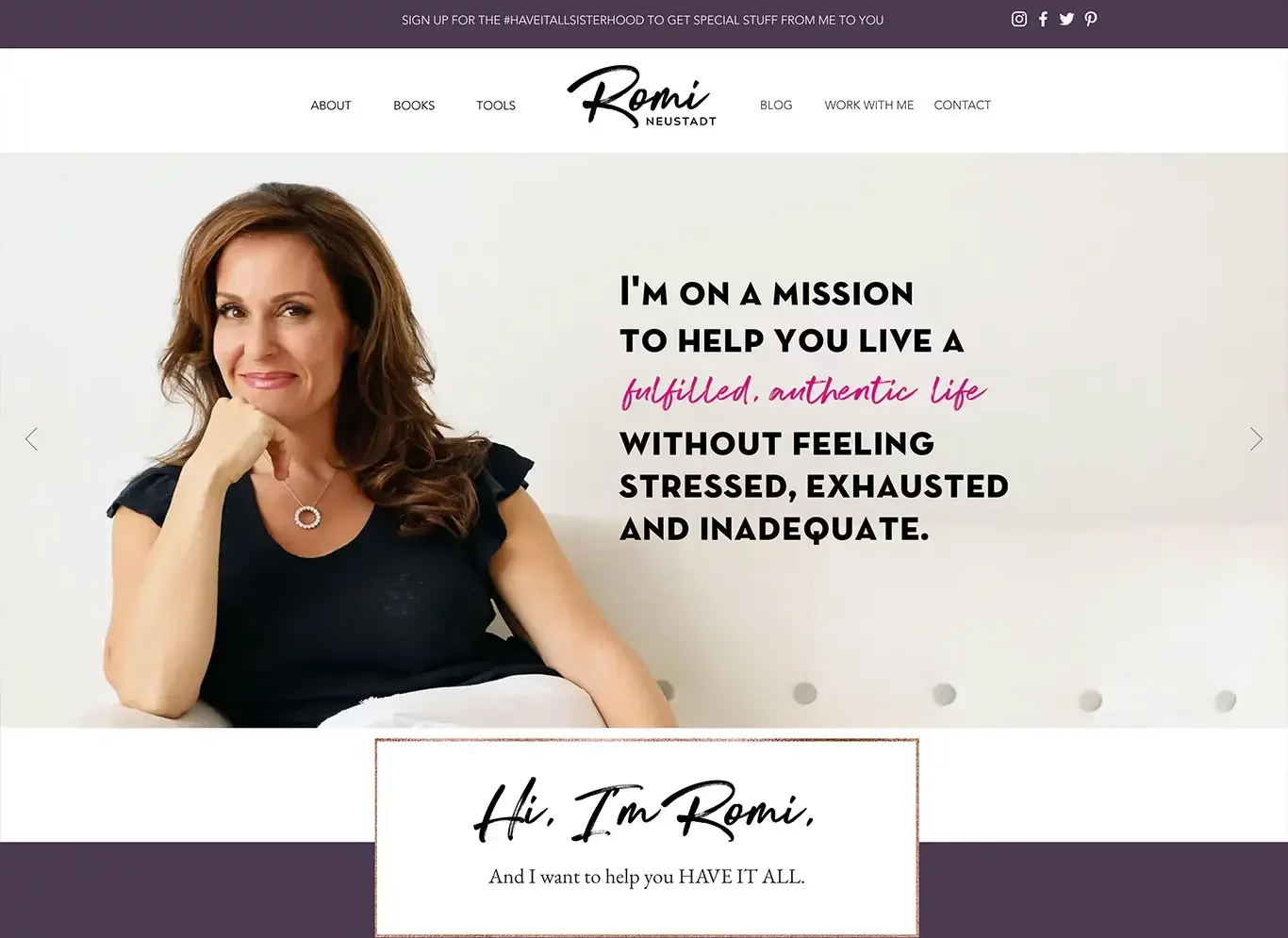
Romi Neustadt’s website blends the authority of a coach with the relatability of a bestselling author. Right away, visitors understand who she is and what she offers — thanks to a confident headline, clean layout, and high-quality photography.
The site is designed to guide action: whether it's buying her book, hiring her as a speaker, or signing up for coaching. The navigation is simple and direct, and the homepage includes testimonials, media mentions, and a compelling opt-in offer.
4. Frontline Publishing
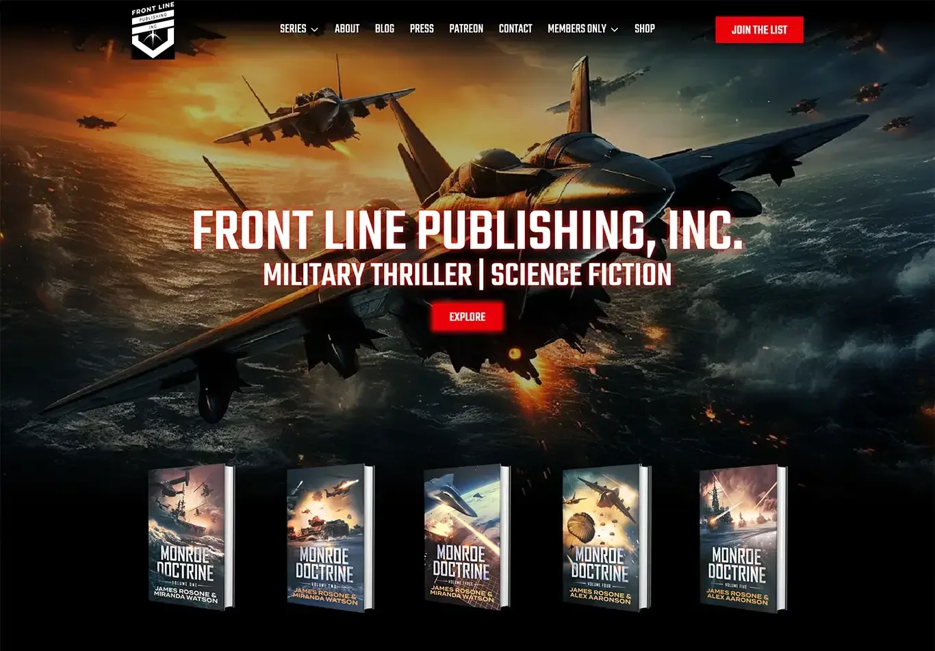
Tracy D. Neal’s site, built under her publishing brand Frontline Publishing, is a great example of combining personal authorship with a broader mission. The design is bold and polished, with a strong spiritual and motivational tone that aligns with her audience.
The homepage features a direct call-to-action to buy her latest book, plus a standout email opt-in. Her story, mission, and offerings are clearly laid out, making it easy for readers and aspiring authors to engage with her work and services.
5. Dani Pettrey
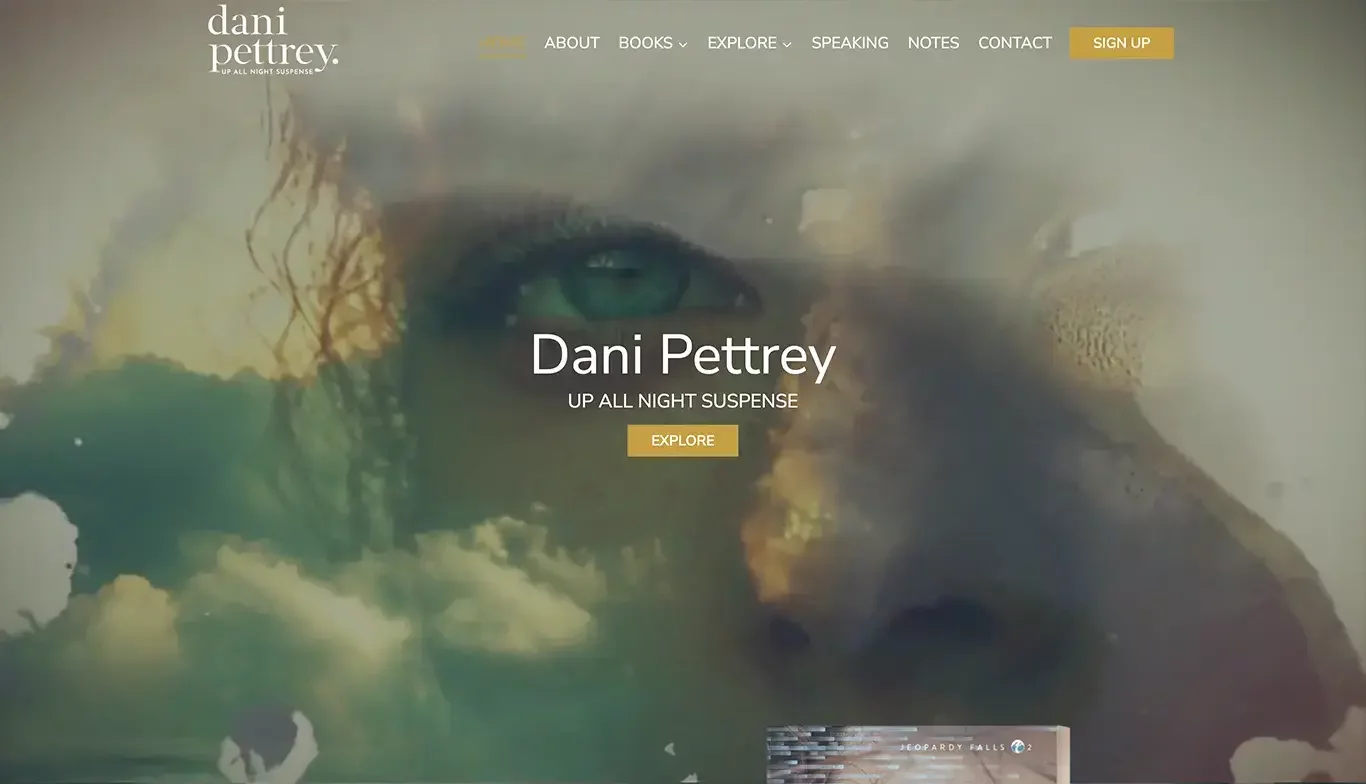
Dani Pettrey’s website is a strong example of designing with your genre in mind. As a bestselling author of romantic suspense, her site immediately sets the tone with moody imagery, a bold serif font, and book covers that speak directly to fans of thrillers and romance.
The homepage prioritizes her latest release, making it easy for visitors to jump straight to a purchase. It also features a clean newsletter sign-up, a compelling “Meet Dani” section, and clear navigation for books, extras, and events.
6. Andrew Clawson
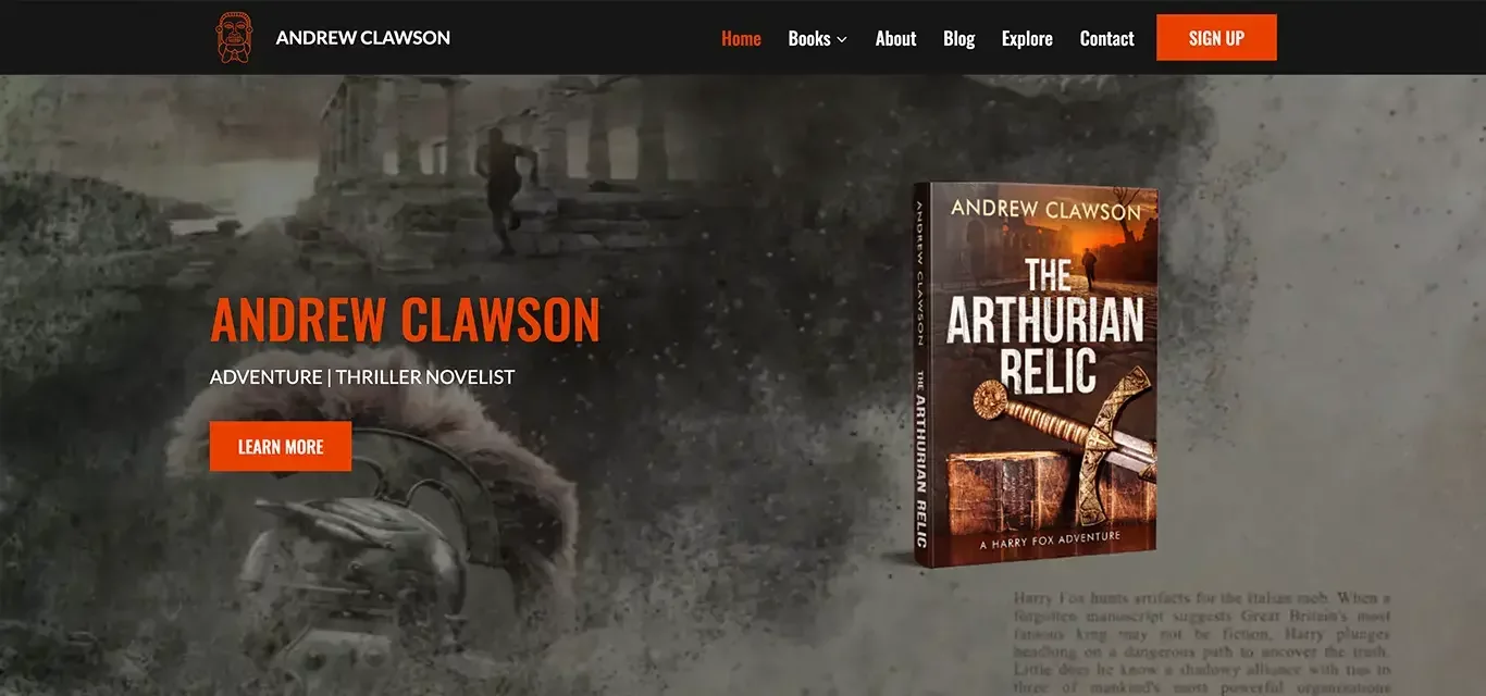
Andrew Clawson’s website embraces clarity and simplicity — which works perfectly for his audience of historical thriller fans. The homepage gets straight to the point, highlighting his latest novels, offering a free book for email subscribers, and guiding readers toward Amazon purchase links.
The dark, moody visuals match the suspenseful tone of his books, while the minimalist layout keeps readers focused. The opt-in for a free ebook is especially smart — it builds his email list while giving new visitors a risk-free way to try his work.
7. Bald Solomon
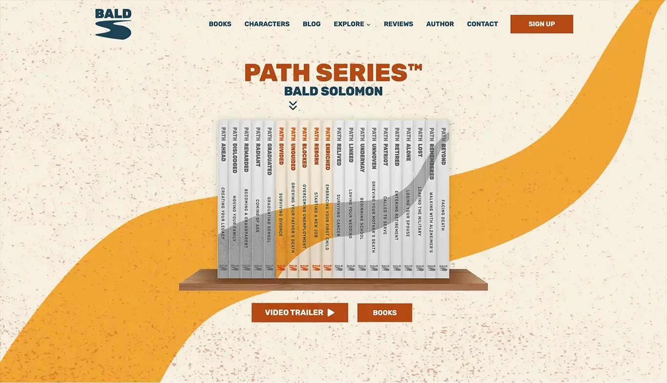
Bald Solomon’s site stands out immediately — and intentionally. The stark design, dramatic typography, and clever use of satire match his unconventional, genre-defying writing style. From the very first scroll, it’s clear this author isn’t afraid to make a statement.
What’s brilliant is how the site leans into mystery. There’s no overload of information — just enough intrigue to spark curiosity, get people clicking, and drive traffic to his book. It feels more like an art project than a sales page — and that’s the point.
8. Your Baton Time
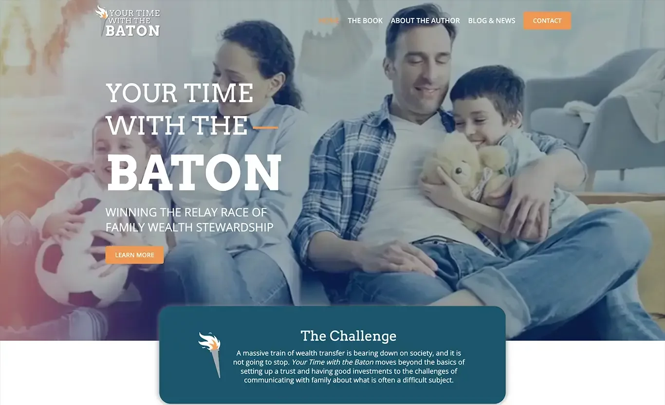
Nikki Ayres’ site, Your Baton Time, blends personal storytelling with a strong sense of purpose. It’s more than just an author site — it’s a platform for inspiration, empowerment, and connection. The design is warm and welcoming, with soft colors, motivational language, and calls to action that invite the reader into something bigger.
The homepage immediately introduces Nikki’s book and mission, with easy access to purchase links, speaking engagements, and a blog. Her brand is crystal clear: uplifting others through storytelling and leadership.
9. MidEast Primer

MidEast Primer is a standout example of an author website built for clarity and impact. The design is minimalist yet highly functional — reflecting the educational nature of the book and its goal to explain complex Middle Eastern issues in an accessible way.
The homepage wastes no time: it introduces the book, its purpose, and a direct call-to-action to buy. There’s no fluff — just a clear message, strong visuals, and a layout that supports focused reading.
10. Live Write Thrive
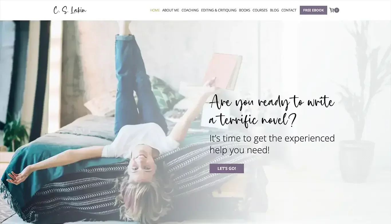
C.S. Lakin’s Live Write Thrive isn’t just an author website — it’s a full-fledged writing resource hub. With hundreds of blog posts, writing tips, and downloadable tools, it offers massive value to writers at every stage. The site is content-rich but well-organized, making it easy to navigate.
What sets it apart is the blend of free advice, premium offerings (like editing and courses), and book promotion — all positioned under one cohesive brand. Her expertise builds trust, and that trust leads to purchases.
11. Sage Mallory
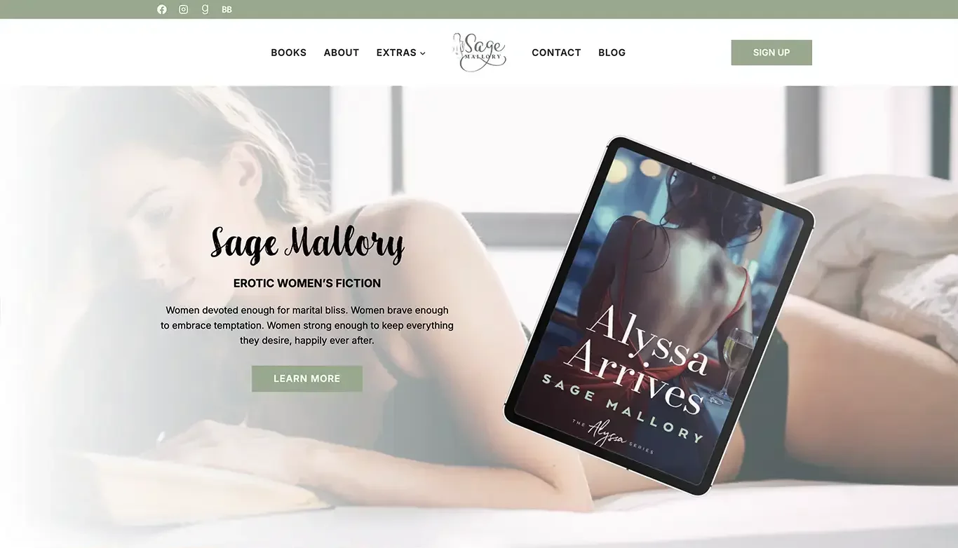
Sage Mallory’s website is a great example of calm, modern branding that still feels strong and personal. The soft color palette, clean layout, and elegant typography create a serene, professional vibe that fits her tone and audience.
The homepage immediately introduces her as a contemporary romance author, with an eye-catching newsletter sign-up and clear links to her latest releases. There's also subtle use of personal photography, which builds trust and helps readers feel a closer connection.
12. Riders of a Certain Age
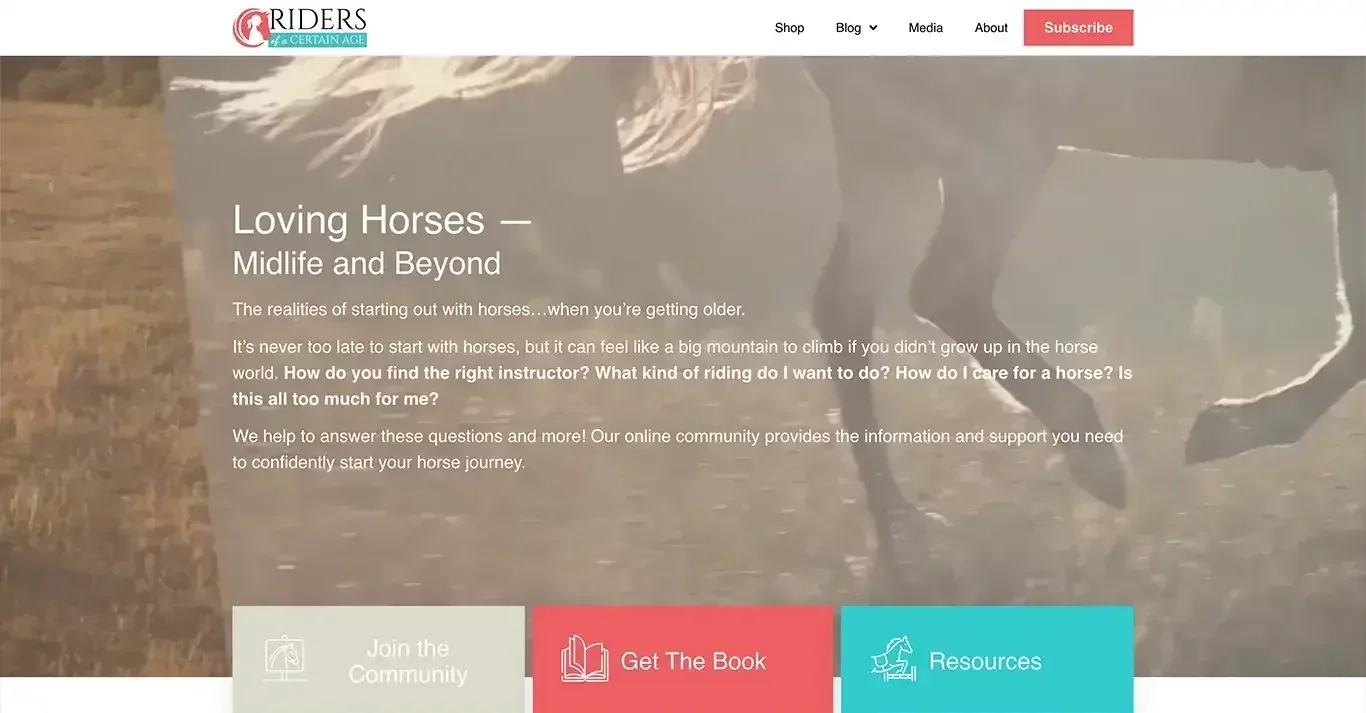
Fran Severn’s Riders of a Certain Age is a perfect example of niche done right. Targeting older women who ride or return to horseback riding later in life, the website immediately connects with a very specific audience — and that’s exactly what makes it so effective.
The design is warm, inviting, and age-appropriate without feeling outdated. The homepage clearly introduces the book and who it’s for, with a friendly tone that makes visitors feel seen. There’s also a prominent buy link and a blog that adds SEO value and deepens engagement.
13. K. C. Aleebooks
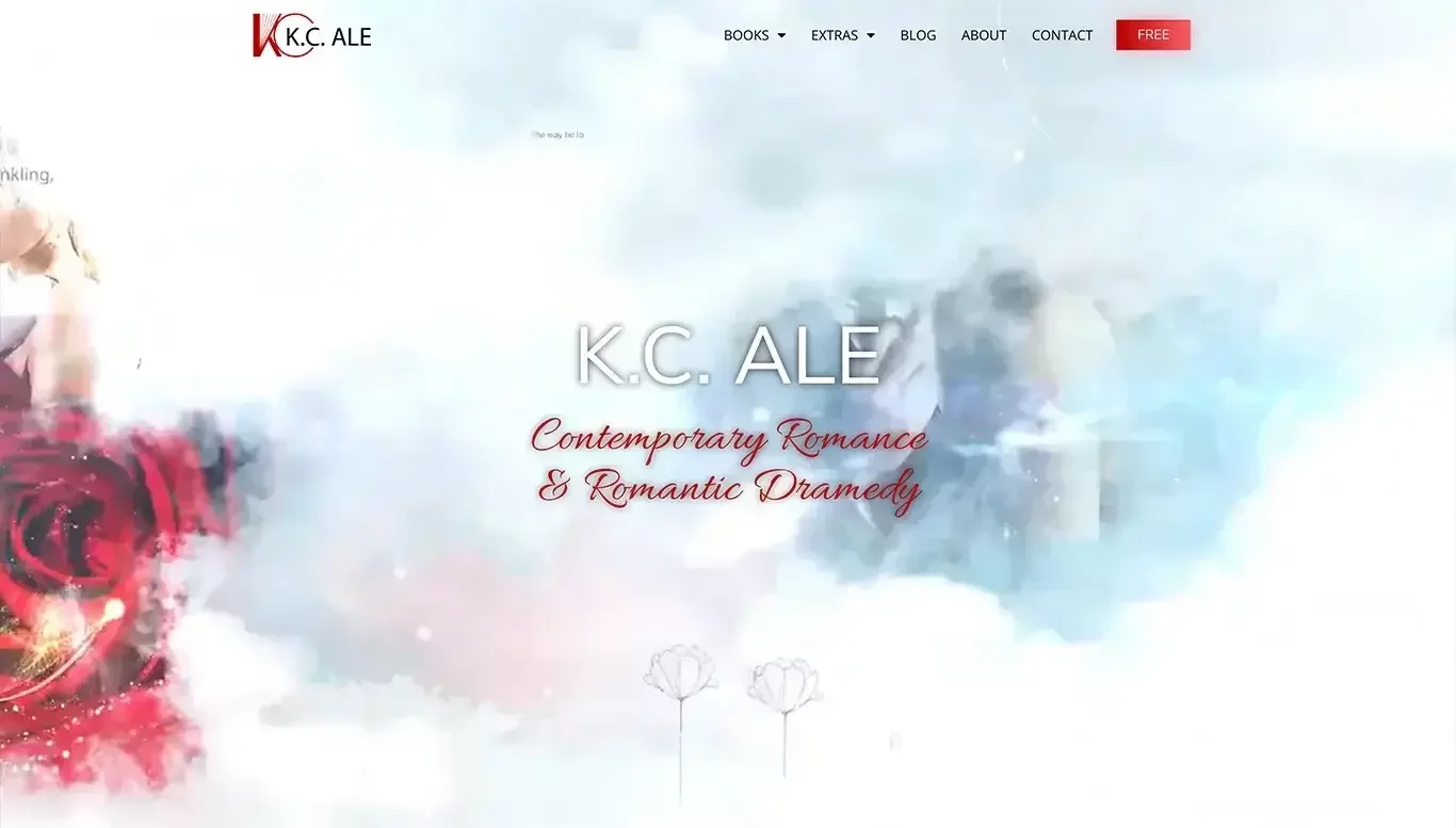
K. C. Aleebooks’ site is a burst of personality — from the bold colors to playful fonts, everything about it feels like a direct reflection of the author’s voice. It’s fun, confident, and immediately engaging, especially for readers of modern, edgy fiction.
The homepage features her books front and center, paired with smart CTAs and a clear author voice that carries across every section. The layout is clean despite the bold visuals, making it easy to navigate without losing that creative flair.
14. Mary Young
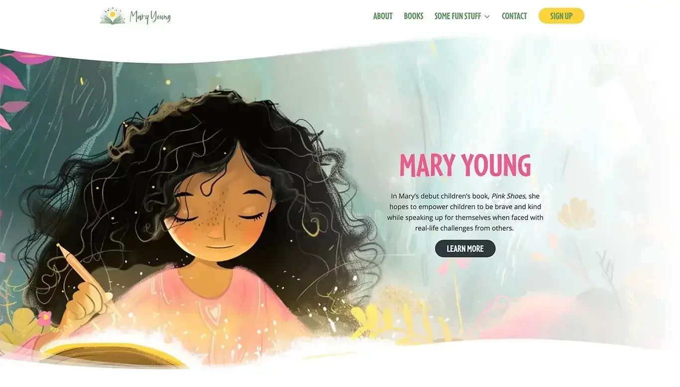
Mary Young’s website offers a serene and heartfelt experience that reflects the spiritual and emotional depth of her writing. The soft colors, warm photography, and graceful typography create a space that feels calming and genuine — just like her message.
The homepage clearly presents her book with a call-to-action to buy, alongside a personal introduction and a gentle invitation to connect. Her story and values are woven throughout the site, helping readers feel emotionally invested.
15. Lynn Westhoff
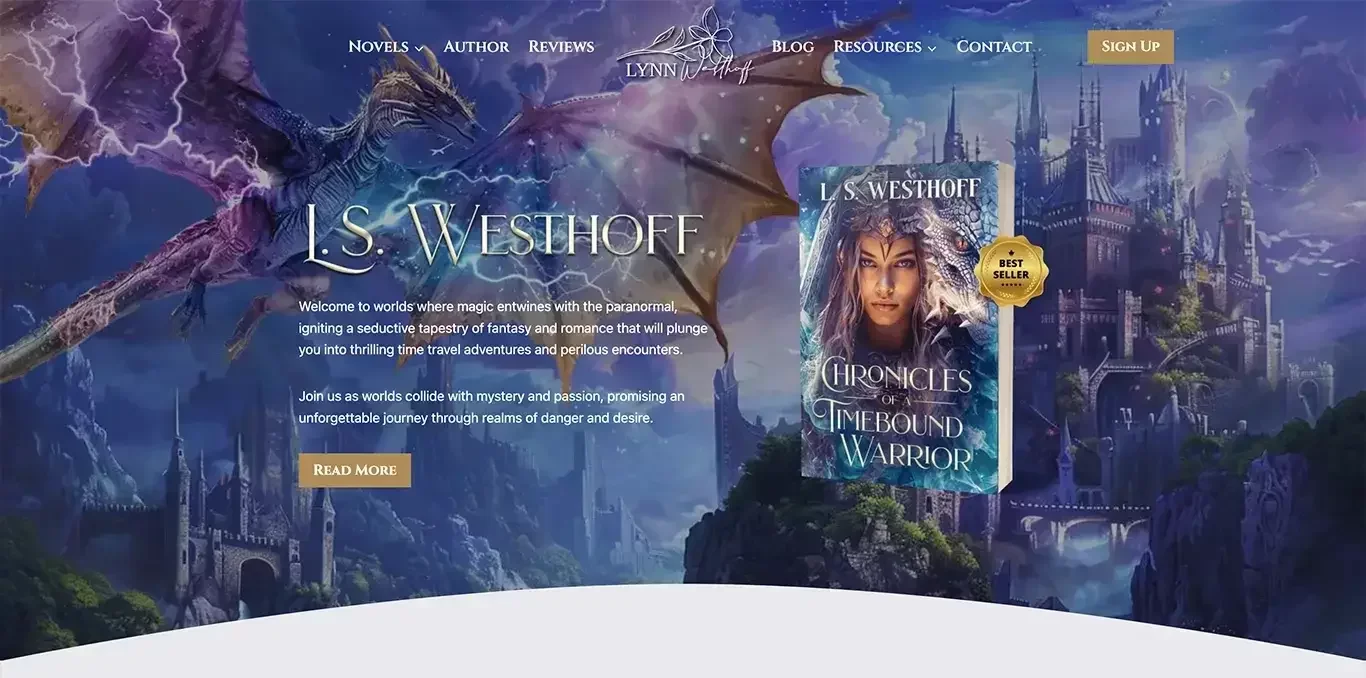
Lynn Westhoff’s website strikes a beautiful balance between professionalism and heart. With a clean, pastel-toned design and thoughtful photography, the site immediately feels warm and personal — ideal for a writer focused on emotional, character-driven stories.
The homepage introduces her latest work with a short blurb and clear buy links, while also spotlighting her story and journey as a writer. It’s simple, effective, and welcoming — exactly what readers want when exploring a new author.
16. Tom LitRPG
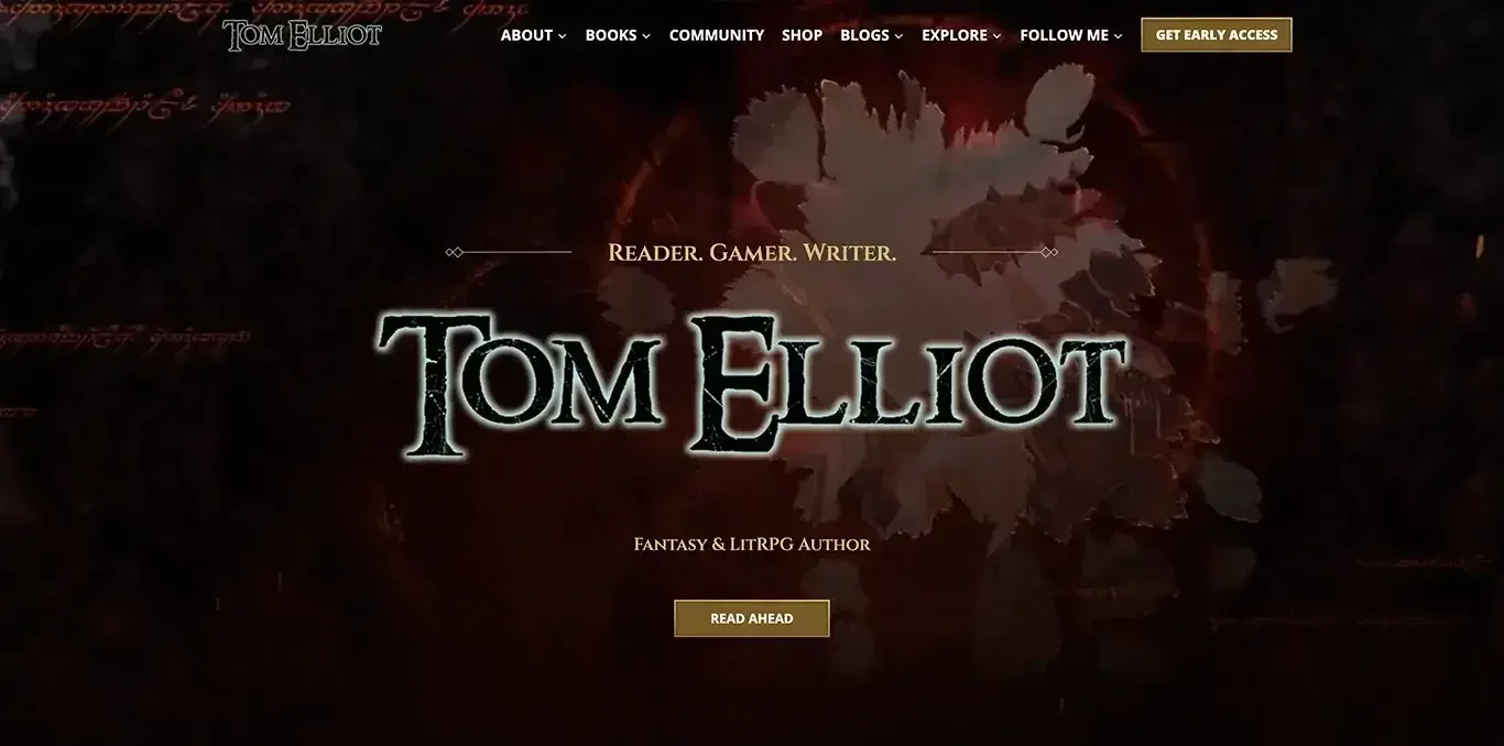
Tom’s site is unapologetically built for fans of LitRPG — and that’s what makes it so effective. From the moment you land, you’re immersed in a world of gaming, stats, and epic storytelling. The neon-accented visuals, digital-style fonts, and clean structure all support the niche.
What really works is the fan-centric approach. Readers can easily jump into a series, claim a free book, and join Tom’s newsletter. Everything is optimized for connection and retention — perfect for a genre that thrives on long-term reader engagement.
17. Maggie Carpenter
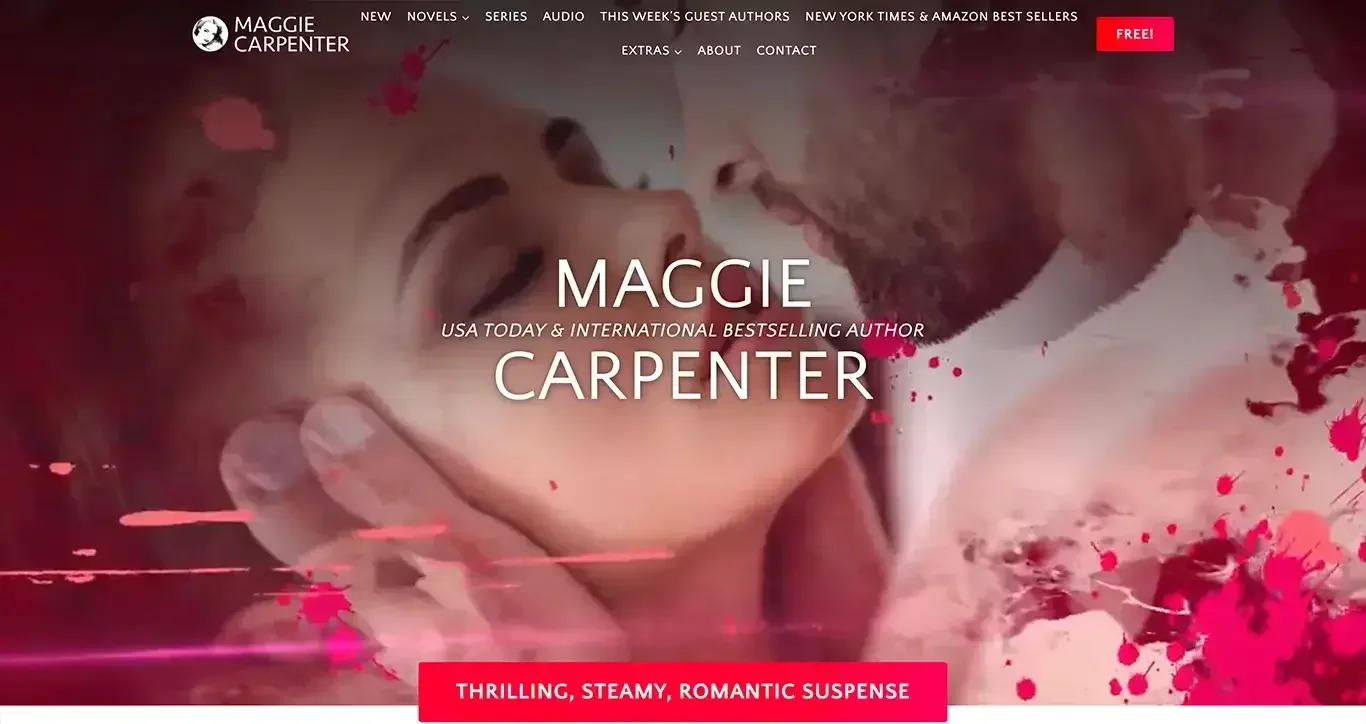
Maggie Carpenter’s website is direct, confident, and unafraid to own its niche. Specializing in steamy, dominant romance novels, the site leans into its branding with bold headlines, high-contrast design, and eye-catching book covers — all tailored to fans of the genre.
The homepage features her latest release, strong calls to action, and quick links to explore her catalog. There's also a free book offer to entice sign-ups — a smart way to grow her reader list. Every element feels intentional and reader-focused.
18. Daniel Gibbs

Daniel Gibbs’ site is built for serious sci-fi readers — and it shows. With a dark, space-themed aesthetic and military-inspired visuals, the design immediately signals genre and tone. The homepage highlights his expansive universe of interconnected series, with clear book order guides and bundle offers.
What makes this site especially effective is its structure. Series are grouped, easy to browse, and supported by detailed descriptions — ideal for new readers and superfans alike. There’s also a strong lead magnet (free prequel) to grow his mailing list.
19. Mike Michalowicz
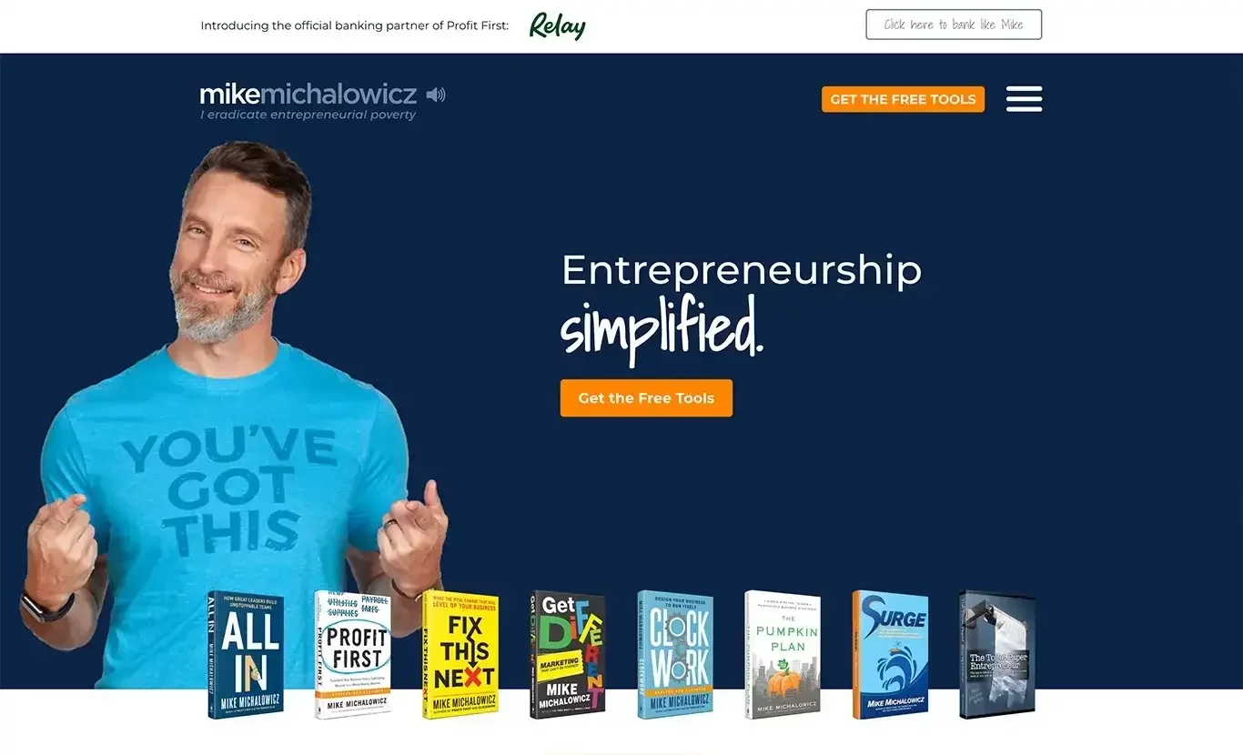
Mike Michalowicz’s website is a textbook example of how to sell non-fiction books effectively. As a bestselling author and business speaker, Mike uses bold branding, confident copy, and strategic layout to highlight his growing library of titles — each one clearly positioned with its own landing page, endorsements, and free resources.
His energetic personality shines through in the copy, videos, and visuals, making the site both informative and entertaining. Most importantly, the homepage funnels users toward clear actions: buy a book, join his newsletter, or book him as a speaker.
20. Leigh Bardugo
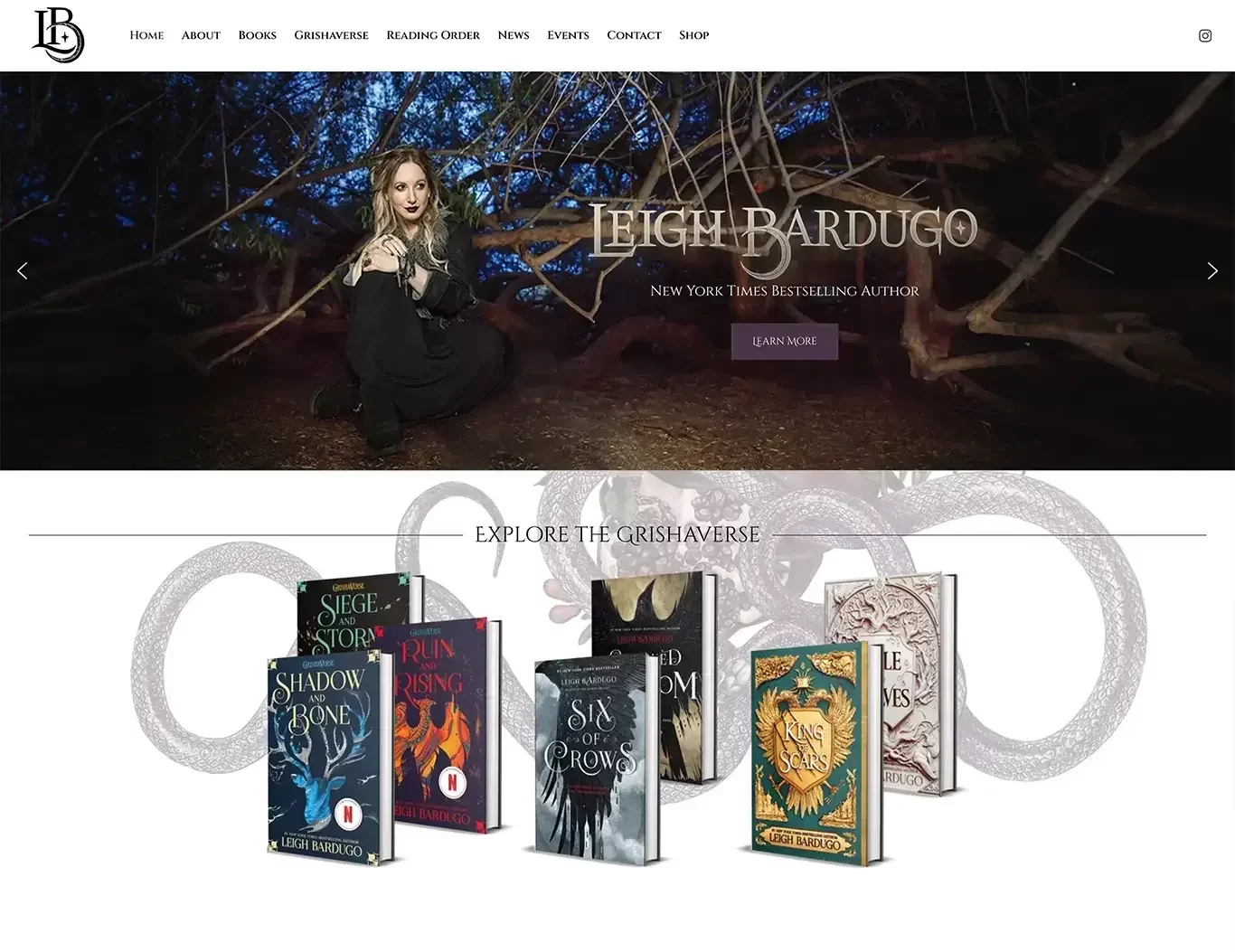
Leigh Bardugo’s site is sleek, stylish, and deeply rooted in the fantasy worlds she creates. From the dark color palette to the elegant typography and immersive visuals, the design feels like an extension of the Grishaverse itself — instantly familiar to her fans.
The homepage focuses on her latest releases with powerful visuals and direct links to buy or explore. It also includes event updates, media mentions, and a smooth navigation experience that keeps readers engaged. Every detail feels intentional and fan-oriented.
Final Thoughts: Learn from the Best to Sell More Books
A great author website isn’t just about aesthetics — it’s a strategic tool for growing your audience and increasing sales. Whether you’re a debut author or a seasoned bestseller, the 20 examples above prove that effective websites come in many forms: minimalist, bold, playful, or deeply immersive. What they all have in common is clarity, personality, and a focus on the reader journey.
Use these sites as inspiration to build (or improve) your own. Think about your audience, your brand, and what action you want visitors to take — and make it easy for them to take it.
